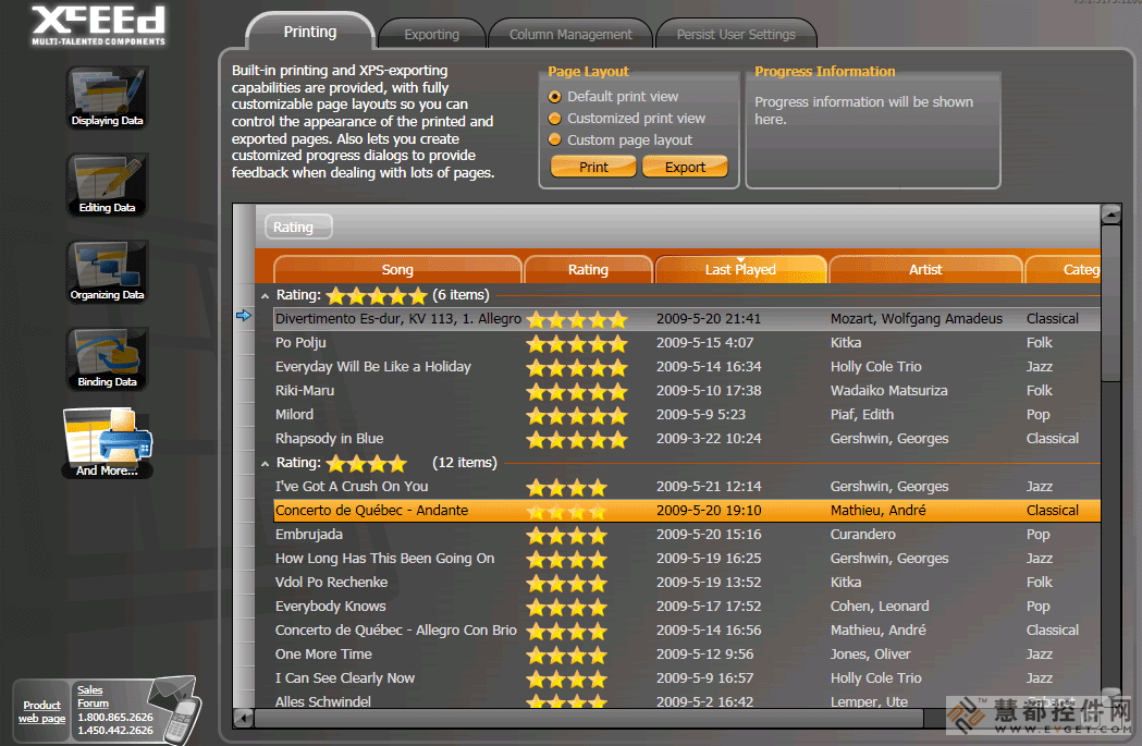
具有经典风格的传统表格和卡片浏览模式,可以在3D设计版面中显示与编辑数据。
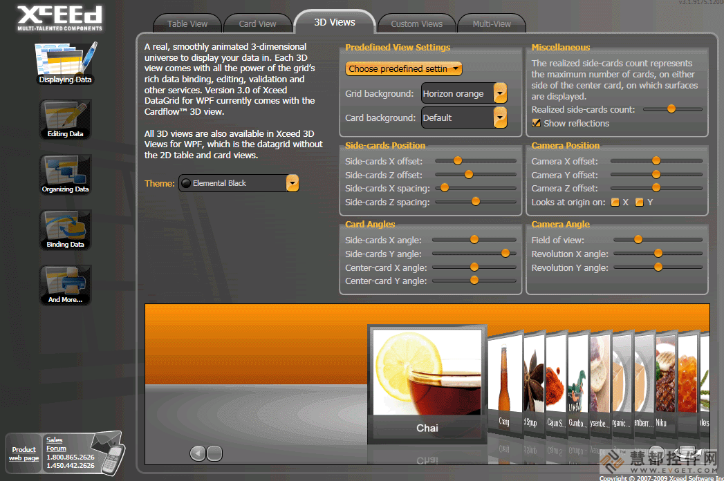
在2D或3D设计版面中显示以及编辑数据。WPF的Xceed DataGrid(Windows Presentation Foundation)是一款网格控制组件,它具有类似于Vista、XP、媒体中心或经典风格的传统表格以及卡片浏览模式并能让您在3D设计版面中显示与编辑数据。
功能包括:丰富的就地编辑功能、具有UI虚拟化的分组功能、高品质的浏览功能(表格与卡片)以及内置数据验证功能。它同样包括WPF日期挑选程序以及日历控制组件。WPF的Xceed DataGrid提供了具有绑定与非绑定数据源的功能;灵活的对象模型以及具有可循环使用成分的完全可扩展功能。WPF的Xceed DataGrid的Express版本是免费版本。请访问'Evals and Downloads'以查看怎样获得免费授权的说明。在Blueprint版本中提供所有的C#与XAML源代码。
Display and edit data in 2D or 3D layouts. Xceed DataGrid for WPF (Windows Presentation Foundation) is a grid control that in addition to traditional table and card views like Vista, XP, Media Center, or classic styles, allows you to present and edit data in 3D layouts. Features include: rich in-place editing; grouping with UI virtualization; production-quality views (table and card), built-in data validation. It also includes a WPF date picker and a calendar control. Xceed DataGrid for WPF offers compatibility with bound and unbound data sources; flexible object model and fully extensible with reusable parts. Xceed DataGrid for WPF Express Edition is free, please, visit the 'Evals and Downloads' Section for instructions on how to obtain your free license. Full C# and XAML source code available in the Blueprint Edition.
WPF / .NET Technology
- Created entirely for WPF and .NET 3.0, written in C# and XAML. Supports .NET 3.5 as well.
- Complete source code is available in the Blueprint Edition. (Only available with the Professional Edition.)
- True lookless WPF control, 100% stylable and templatable. You can completely change the way the entire control looks and behaves. Create 3D rolodex, carousel, timeline views, etc.
- Supports UI virtualization, even when grouping data, so only elements currently in view are created and kept, meaning faster loading time, uses less memory.
- Design-time support in Visual Studio 2008 and Expression Blend.
- Design-time configuration window that lets you set up the most important features quickly and easily.
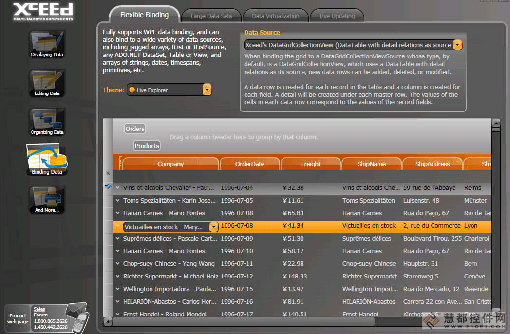
Master/detail capabilities
- Provides hierarchical master/detail capabilities.
- Each datarow in the main grid or in a detail can have an unlimited number of details attached to it.
- Details can have “sibling” or “child” details, or both.
- Details support headers and footers, grouping, sorting, and autofiltering.
- Different style for the data items contained in each same-level detail.
- Custom grouping in grid and details supported.
- Custom detail relations supported.
Views and themes
- Presents data and lets users edit it in any 2D or 3D layout you can imagine.
- Ships with two 2D views (traditional table view and card view). Achieve the look of traditional XP or Vista applications with a true native WPF control.
- Ships with all Microsoft Windows themes: Classic (NT), Luna (XP), Aero (Vista), and Royale (Media Center).
Rich in-place editing
- Features rich in-place editing that works in all views.
- Provides configurable keyboard and mouse edit commands.
- Programmatic control over edit mode.
- Provides Excel-like default keyboard and mouse edit behavior, including F2, Esc (cancel edit on a cell and restore the original value), Double-Esc (cancel edit on the entire row and restore the original values), and Enter.
- Allows you to specify a different visual template for a cell being edited.
- Cell editors can be displayed without entering edit mode, under a variety of conditions such as a mouse hover over the cell or row, the cell or row becoming current, the row being edited, or always.
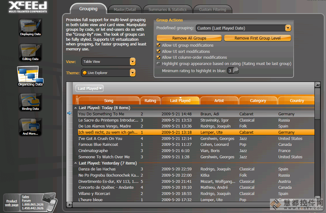
Data grouping
- Supports hierarchical, multi-level grouping in all views.
- Customizable group-level configurations with header and footer support.
- Supports UI virtualization, preserving memory and reducing load time, even when grouping.
- Supports custom grouping criteria, to allow your code to group together rows with your own conditions.
- Interactive, hierarchical “Group-by” row allows end-users to easily create and manipulate groups themselves. Adapted for all included views.
- Programmatic control over expanding and collapsing groups.
- Grouping can be controlled via code.
Input validation
- Includes built-in data validation, at the cell or row level.
- Error display is integrated with the included views.
- You can completely style the way a cell or row looks when a validation error occurs.
- Can validate on any criteria, including the values of other cells.
- Validation error messages are overridable and localizable.
- Expandable and compatible with custom validation rules you have already built.
Card view features
- Defaults to cards stacked into columns, with horizontal scrolling.
- Two types of card view styles are included: compact card view (borderless cards with column separator lines) and standard card view (cards with borders, but no separator lines).
- Supports grouping with multiple levels. Group-by row includes built-in list of columns, so end-users can still group by columns and reorder fields even if there are no column headers. Group headers flow within the card list.
- Cards can be independently sized, each card sizing itself to its content.
Table view features
- Includes an Outlook-style table view with all the typical elements you would expect.
- Column headers support drag-and-drop column reordering, column resizing, click-to-sort, and dragging to "Group-by" row.
- Row margin selects and resizes rows, and displays icons indicating that the row is current, is being edited, is an insertion, or has a validation error.
- Provides horizontal and vertical Grid line brush and grid line thickness properties.
- Automatically changes a row’s height to fit the contents of the largest cell.
Other features
- Full keyboard navigation is possible through cells and rows. Navigation can be limited to cell-only or row-only, or navigation can be disabled.
- Allows multiple-field sort and custom criteria sort.
- Provides easy manipulation of the grid’s current row.
- Scrolls the view to any cell, row, group, or column.
- Scroll tip displays information about the first visible row in the viewport when the grid is scrolled.


 首页
首页 


 实时了解产品最新动态与应用


 相关产品
相关产品 授权相关问题
 微信
微信 在线咨询
在线咨询


 渝公网安备
50010702500608号
渝公网安备
50010702500608号

 客服热线
客服热线